top of page

Freelance Client - Sip & Dip Coffee Beans Company

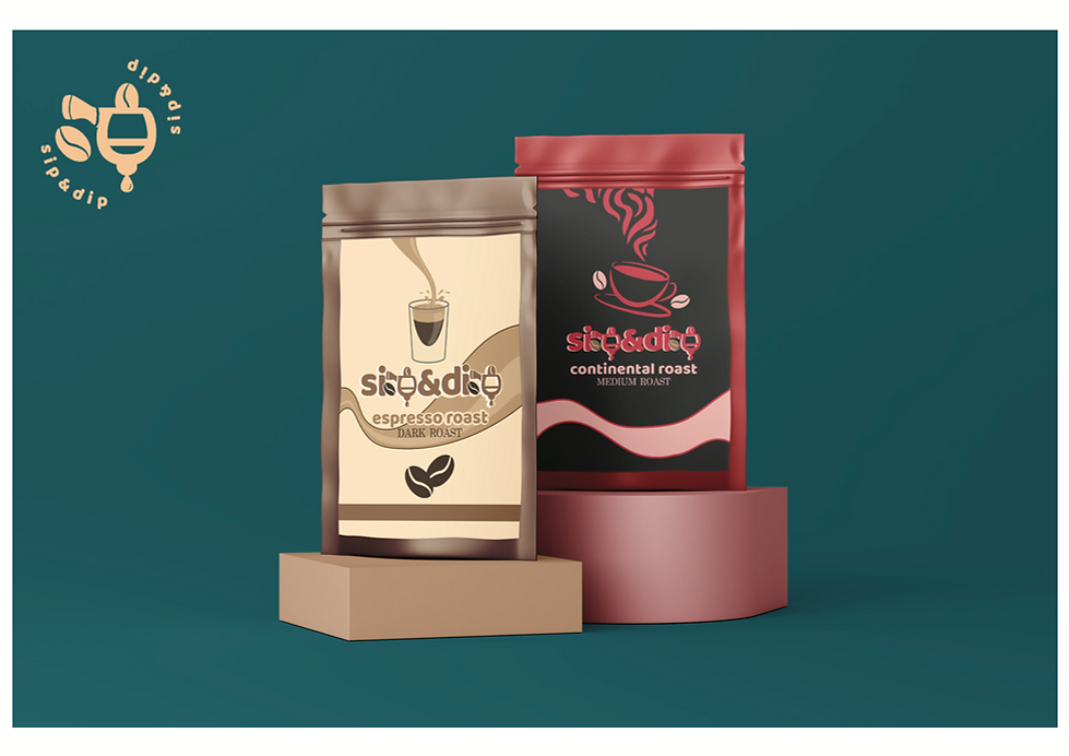
Sip & Dip is a student-founded coffee brand in Pakistan that reached out to me to create a youthful and playful visual identity for their launch. The founders wanted a brand that felt vibrant, aesthetic, and relatable to college students—something distinct from typical coffee branding. I designed the logo, submark, icon, and color scheme, along with packaging for four coffee roasts—two regular and two limited edition blends. To break away from clichés like mugs and beans, I turned the letter “P” in Sip & Dip into a portafilter holding ground coffee, symbolizing both creativity and craft. The final logo incorporated subtle coffee bean motifs for added personality.


Adobe Illustrator, Photoshop, InDesign & Figma.

sip&dip - coffe beans brand - 2.png
sip&dip - coffe beans brand - 3.png
sip&dip - coffe beans brand - 4.png

For the limited edition blends, I explored narrative-driven designs:

  • Cinnamon Roast: Inspired by the warmth and coziness of a campfire, I used cinnamon sticks as visual “logs,” evoking comfort and familiarity.

  • Blonde Roast: Taking cues from Marilyn Monroe’s iconic “Diamonds Are a Girl’s Best Friend” look, I created a playful, feminine design featuring an illustration of Marilyn, a pink palette, and a flowing strip of blonde hair resembling steam rising from a mug.

These designs balanced humor, warmth, and style—capturing Sip & Dip’s youthful energy while giving each roast its own unique character.

sip&dip - coffe beans brand - 5.png
raahim tariq.png
contact icons.png
contact icons.png

©Raahim Tariq Studios all rights reserved 2025 | Design by Raahim Tariq | Site Development by Raahim Tariq

bottom of page